
Introduction
Welcome to the French Digital Library project! This project was a collaborative effort by four students in a Master's HCI module called User-Centered Design at the University of St Andrews, working with a real-time client — Dr. Pauline Soulea, French language lecturer at the School of Modern Languages at our university. Over a period of 12 weeks, we transformed an outdated digital library into an engaging, intuitive and accessible platform bursting with rich French language resources. Think of it as turning an old, dusty library into a vibrant, digital haven for learners and educators alike.
Problem Statement
The existing French Digital Library had several usability issues, including a cluttered interface, inefficient search functionalities, and accessibility concerns. The objective was to redesign the the platform to better meet the needs of both students and educators, facilitating independent study, lesson planning, and resource curation.
Our goal? A complete overhaul to make the system delightful to use!
Research
User Research
We conducted user research through interviews, observational studies (involved watching participants use the old prototype to complete specific tasks), and surveys to understand user needs, preferences, and pain points.
User Groups: University students, French language learners, teachers, and lecturers.
I played a key role at this stage by drafting all the questions for the client interview, setting up a 'when2meet' calendar for efficient scheduling, and suggesting strategies to make the most of our research. Additionally, I conducted user interviews and observational study for 5 out 12 students and teachers, took detailed notes, and contributed to the creation of a Miro Board for documenting insights. These efforts helped us gather comprehensive insights on how users interacted with the existing prototype and identify key areas for improvement.

Fig 1 Miro board: Notes from preliminary meeting with our client
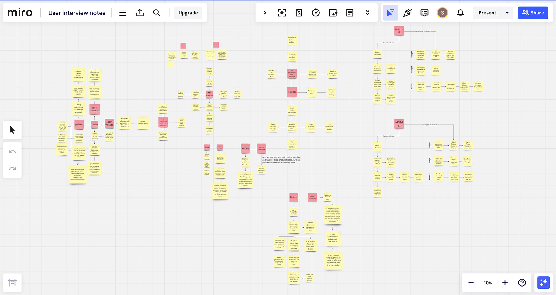
Fig 2 Miro board: Notes from User Interviews
User Personas
Persona 1: Ben - A Final Year Primary Student
Name: Ben Button
Occupation: Full-time primary student
Location: Harrogate, England
Age: 10
Interests: Enjoys French in school and playing video games
French Language Proficiency: Beginner level
Quotes
- "I like when I can practice my French with games - it doesn’t feel like work"
- "I like French in School and want to show my teacher that I am a good student"
- "I like when I can practice my French with games - it doesn’t feel like work"
- "I like French in School and want to show my teacher that I am a good student"
Persona Description: Ben is in year 6 of his studies in primary school in Harrogate. In class, they have been learning how to tell the time in French and playing 'Jaques Dit!' (French Simon Says). Ben went to France on holiday with his family, and is desperate to go back so he can show off his French!
Motivations: Ben loved the French food when he visited France with his family, his best French sentence is "Je voudrais un croissant s'il vous plaît!", he can't wait to go back and say it.
Frustrations: Looking at long lists of French vocabulary and boring grammar rules makes it hard to study
Personal Notes: Ben plays video games every day after school, and so is particularly interested in finding online games that incorporate French. At the moment Ben finds resources through his teacher, he is unsure how to do this independently at this stage.
---
Persona 2: Jenny - The First Year French Student
Name: Jenny Smith
Occupation: Full-time student at St Andrews
Location: St Andrews, Scotland
Age: 19
Major: Studies French alongside History
Interests: Loves film and cinema
Quotes
- "The commute to class takes ages! Music makes it go by so quickly"
- "I love to relax with a film at night while still feeling like I'm working to improve my French"
- "The commute to class takes ages! Music makes it go by so quickly"
- "I love to relax with a film at night while still feeling like I'm working to improve my French"
Persona Description: Jenny is in her first year at the University of St Andrews, studying French and History. She is originally from London and loves film and cinema. Jenny regularly likes to combine her love for cinema and the French language, using films to do so. Her high school did not offer advanced French, so she uses online resources very often in an attempt to catch up!
Motivations:
- Jenny's motivation is to improve her knowledge of the French language, in order to maintain good grades and to prepare her for a year abroad in Québec City, Canada.
- Jenny is also motivated by her love of films; it means she can improve her French while relaxing and doing her hobbies - it’s a win-win situation!
Frustrations: It frustrates Jenny to look for resources online when it takes ages to find a film she will actually enjoy and engage with, also to find resources respective to her level of French.
Personal Notes: As Jenny uses these resources to maintain her grades, she likes to be able to ones that relate to the topics she is currently studying. Jenny currently lives in Dundee due to the student housing crisis, and enjoys listening to music and podcasts on her long commute to class.
---
Persona 3: Mrs Walker - A High School French Teacher
Name: Leslie Walker (Mrs Walker to her students)
Occupation: Full-time high school teacher
Location: Glasgow, Scotland
Subjects Taught: Teaches French to kids between ages 11-18
Experience: Been teaching for 25 years
Quotes: "Sometimes I struggle to provide my students with online French resources as I'm unsure how to find something that each individual will like and engage with."
Persona Description: Mrs Walker has been teaching for a long time now, and is loved by all of her students as a caring and humorous teacher. She tries her best to keep her content engaging for a young audience, while also following the curriculum. Mrs Walker is the head of her department, and loves to share her passion for French with her colleagues and students alike.
Motivations: Mrs Walker wants to find engaging resources that will encourage her students to study more, and that she can use to advise her colleagues to use for their own lessons.
Frustrations:
- The content she is looking for has to be both appropriate for students at each level, yet also following the curriculum in terms of content.
- She currently dislikes recommending resources to students, as she doesn’t know their individual preferences towards movies and music etc. and she is very careful to not dishearten or bore them.
Personal Notes: Mrs Walker loves kids and also has two of her own. She would like to be able to incorporate some online resources into her lessons to modernize the course a bit, however it needs to be reliably suitable for all age groups and not contain any content triggers.

Fig 3 Customer Journey Map of Mrs. Walker, a French language Teacher
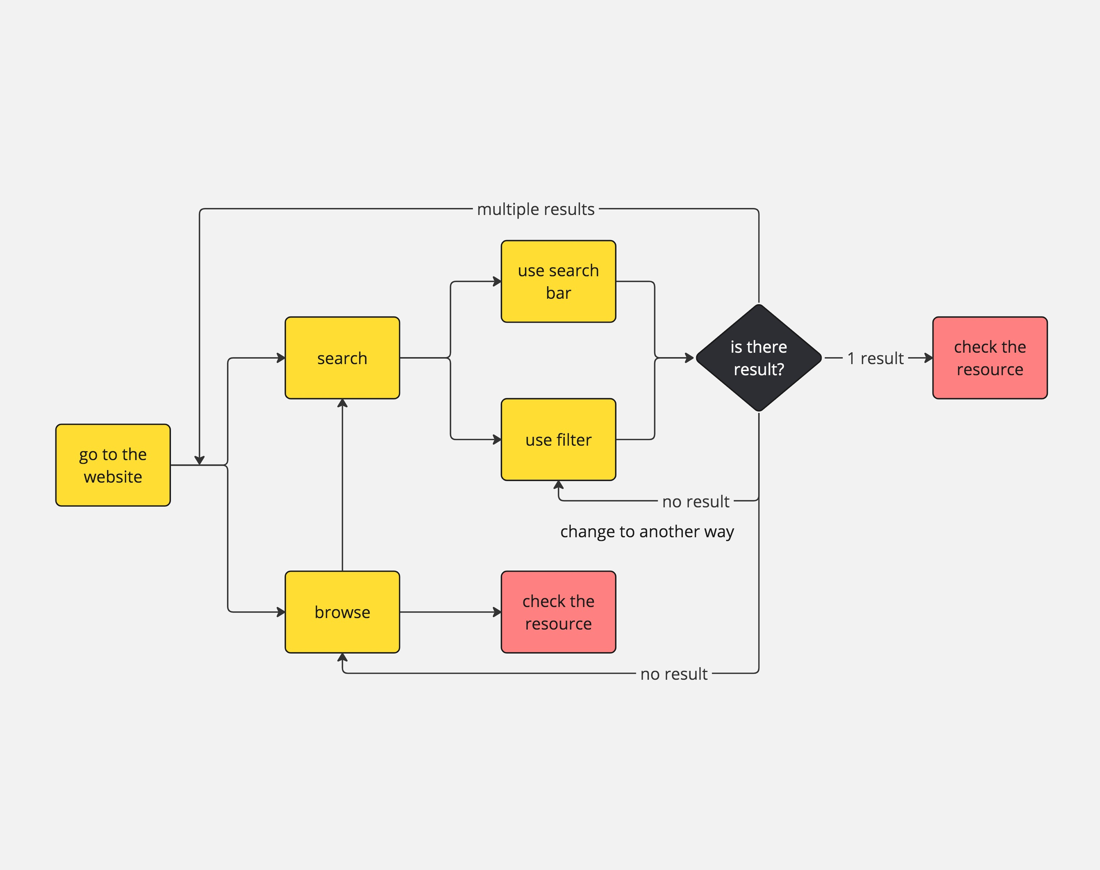
Fig 4 Task Sequence Model for finding resources on the application
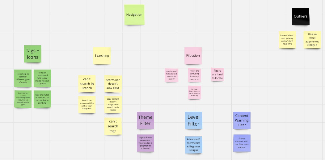
Fig 5 Affinity Diagramming
Few Findings
Navigation Issues: Users found the navigation cumbersome, with confusing filters and dropdown menus.
Accessibility Concerns: Insufficient colour contrast and inconsistent design elements hindered usability.
Content Discovery: Users struggled with the search functionality, which lacked predictive text and live search features.
Design Process
Ideation
We explored various design concepts through a mood board, 16 scenario sketches, and 12 concept sketches. This phase involved brainstorming sessions and collaborative discussions to refine our ideas. My contributions included actively participating in the creation of mood board, developing 4 scenario sketches that depicted key user (focusing on teachers and educators) interactions, and proposing 2 innovative concept sketches. I also played a significant role in the selection process, prioritizing sketches that offered diverse use cases and showed potential for further development.
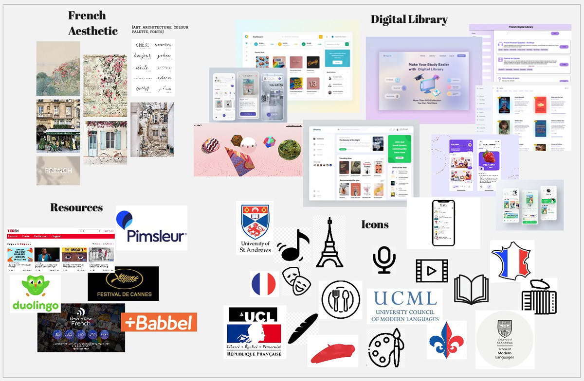
Fig 6 Mood board
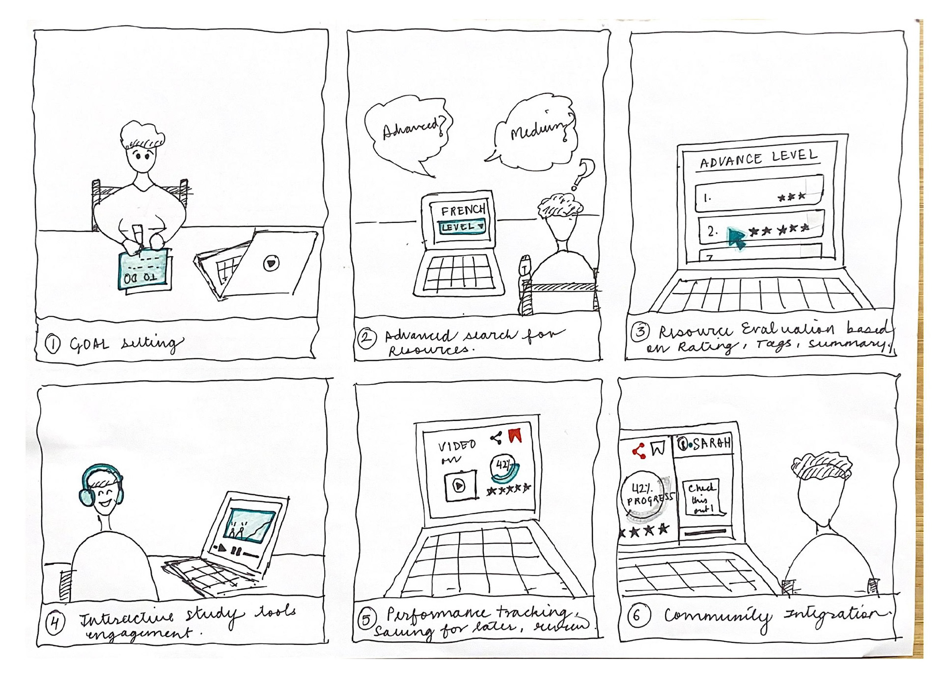
Fig 7 Scenario Sketch: Student studying using the app
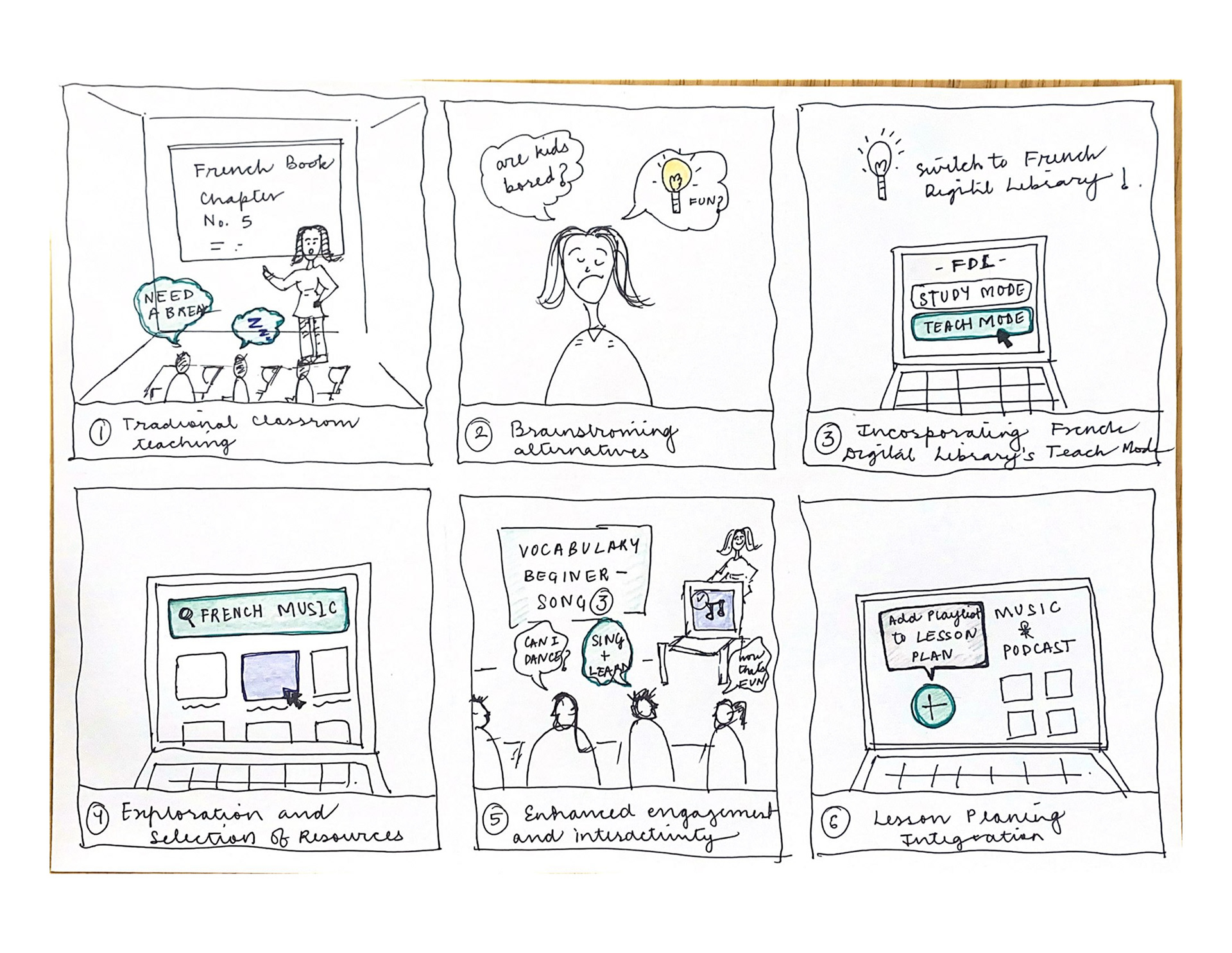
Fig 8 Scenario Sketch: Teacher using the app to teach in class
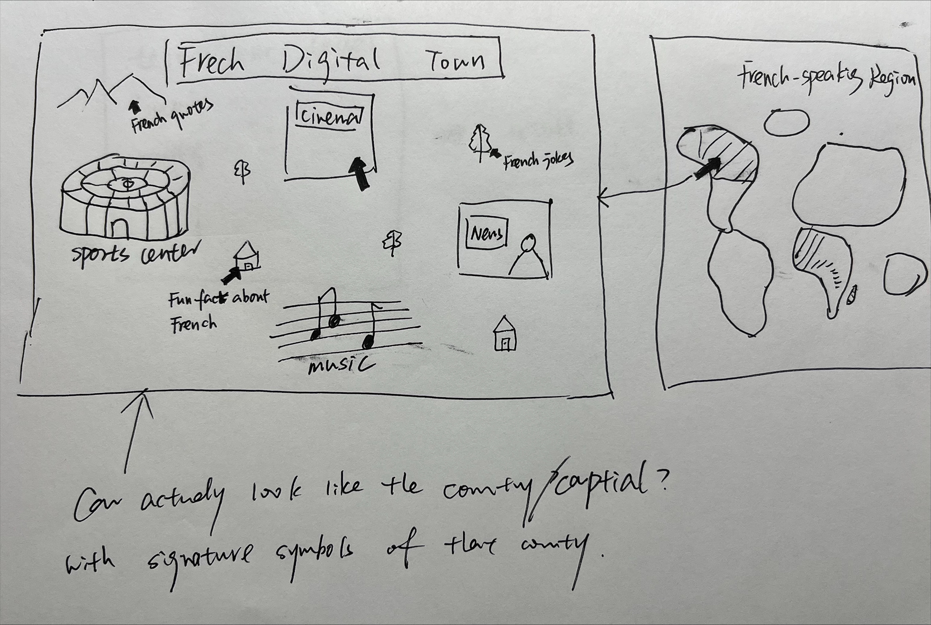
Fig 9 Concept Sketch:
Design Concepts
Conservative Design Approach (Fig 7, 8): The conservative design approach aimed to enhance the French Digital Library by focusing on usability and familiarity. It preserved traditional design elements while improving the overall user experience through thoughtful layout and intuitive navigation. This approach ensured that users could easily adapt to the new system without a steep learning curve, making the platform more accessible and efficient for both students and educators.
"Out-of-the-Box" Concept (Fig 9): This design approach took a bold and creative direction, transforming the French Digital Library into an interactive and engaging experience. This design featured innovative elements like an interactive global map and a virtual French town, where users could explore different sections such as news, library, and theater. This gamified approach aimed to make learning more immersive and fun, appealing especially to younger users and those looking for a more dynamic way to discover resources.
Heuristics Evaluation
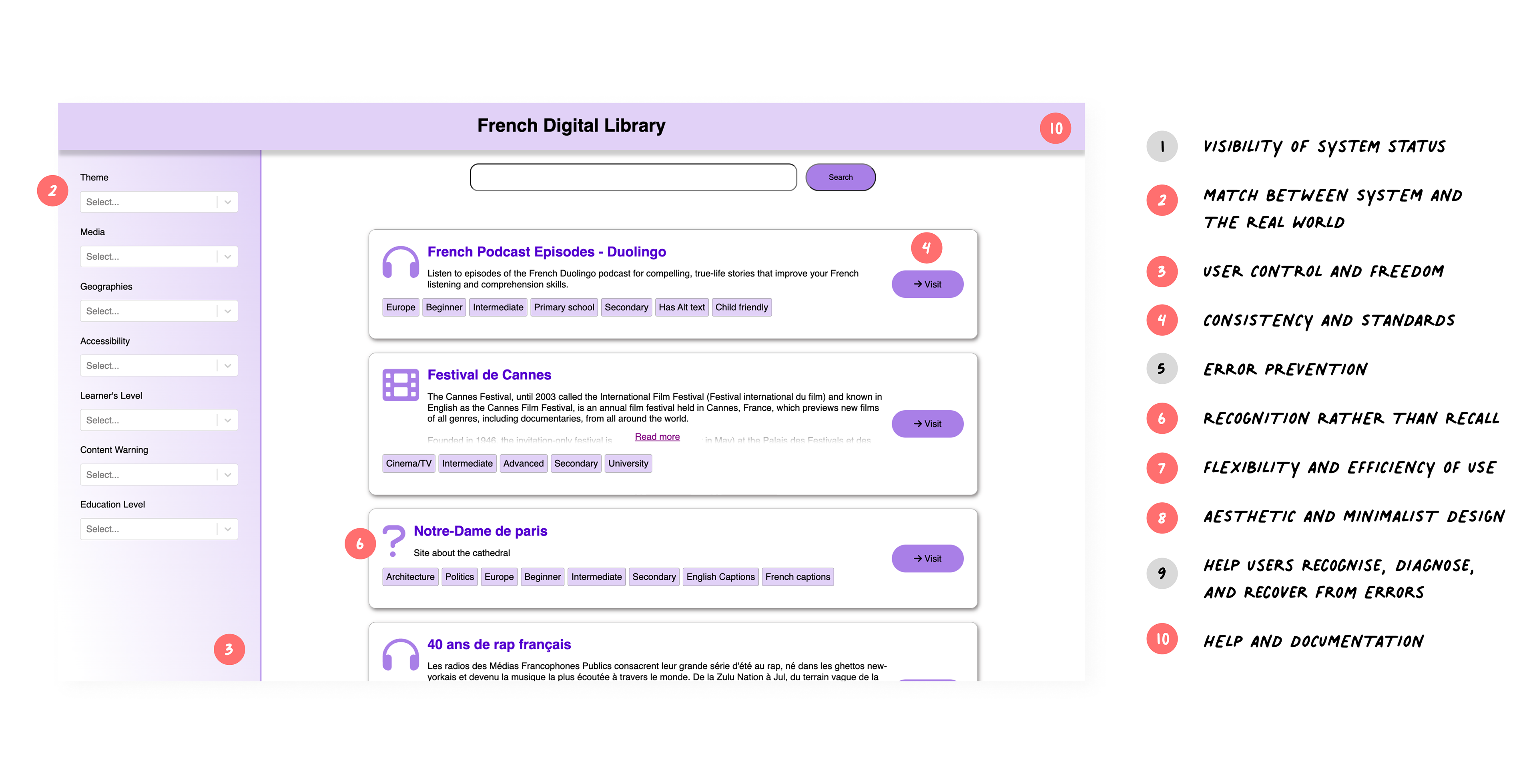
Fig 10 I conducted Heuristics Evaluation on old French Digital Library prototype
Match Between System and the Real World
Issue: Some terms, like "Themes" and "Media," might be unclear to some users.
Recommendation: Use more descriptive terms or provide brief explanations or tooltips to clarify what each filter category entails.
User Control and Freedom
Issue: There is no visible option to clear all filters or undo actions.
Recommendation: Add a "Clear All" or "Reset Filters" button to allow users to easily revert to the default state.
Consistency and Standards
Issue: Inconsistent use of icons and text can confuse users about the function of certain elements.
Recommendation: Ensure that icons and text labels are used consistently across the site. For instance, buttons should look identical and be positioned uniformly and differences in the style can be seen in "search", "visit" and "read more".
Recognition Rather Than Recall
Issue: Users might not easily recognize the function of some icons without explanatory text.
Recommendation: Add labels next to icons or use tooltips that appear when users hover over them to enhance recognizability; a question mark icon really leaves a question mark in the heads!
Flexibility and Efficiency of Use
Issue: Lack of visible advanced user options to streamline repetitive tasks.
Recommendation: Implement keyboard shortcuts for common actions and allow users to save filter presets for quicker access.
Aesthetic and Minimalist Design
Issue: While the design is clean, the sidebar might seem overwhelming with too many filter options at once.
Recommendation: Use collapsible sections in the sidebar to group related filters, reducing visual clutter and making it easier for users to find what they need.
Help and Documentation
Issue: There is no visible help or documentation link for users who need assistance.
Recommendation: Add a help section or a FAQ page, and include a visible link to it. Provide contextual help through tooltips or a help icon.
Wireframing
Low-Fidelity Wireframes: Initial wireframes focused on reorganizing the layout for better usability. Tools used: Balsamiq, Paper Prototype and Figma.
High-Fidelity Prototypes: I created the conservative designs using Figma, these prototypes showcased the redesigned interface with improved navigation, enhanced search functionalities, and a more visually appealing design.
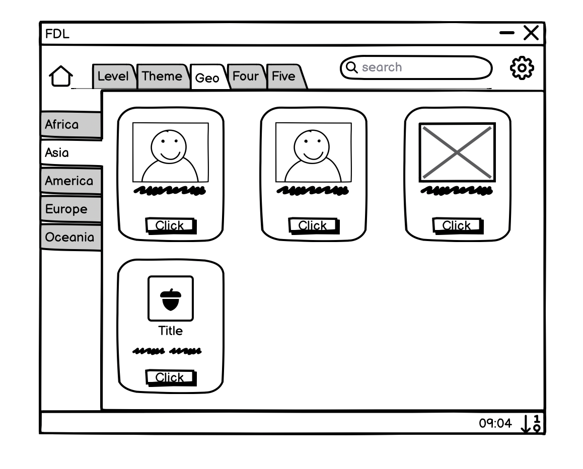
Fig 11 Lofi wireframe of the conservative app
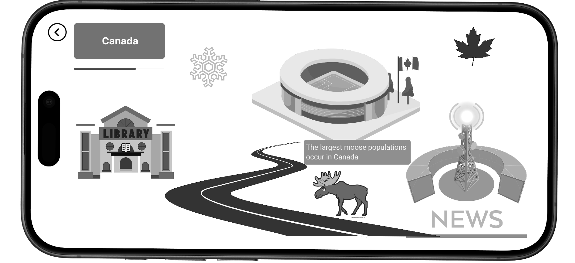
Fig 12 Wireframe of the out of the box concept
The redesigned French Digital Library system shown in Fig 13. is a high-fidelity design and an interactive prototype. Since we already had an existing design, creating high-fidelity visuals and a prototype allowed us to demonstrate clear progress and provide a more tangible representation of the proposed redesign. This approach enabled us to effectively communicate the improvements, validate design decisions, and gather additional feedback before proceeding with development.
The design adopts a modern web app layout with a fixed sidebar and header, presenting content in an organised, card-based grid. The header features breadcrumb navigation (Hick's Law: Simplifying choices for users by providing clear navigational paths), a prominent search bar, notification icons for updating users with new resources, and the option to toggle between grid and list views. The sidebar includes the library's logo, browsing tab, recently viewed and bookmarked items, a curriculum section tailored for educators, logout and help functions, and a language toggle to translate content into English – addressing the needs of beginner students identified during user interviews.

Fig 13 Landing page of the redesigned web app designed on Figma
Particular attention has been given to improving content warning handling, with sensitive information icons and clear tags displayed on resource cards (Aesthetic-Usability Effect: A visually pleasing design enhances usability). Users can click on cards to access detailed resource pages, enabling actions like visiting websites, bookmarking for later, and sharing links (Fitts's Law: Placing interactive elements closer to expected cursor positions to reduce interaction time). Alternatively, hover functionality on the cards provides quick content previews without additional clicks (Doherty Threshold: Providing immediate feedback keeps users engaged). The visual design incorporates a neutral color palette to highlight content, clear typography for improved readability (Von Restorff Effect: Distinctive items are more likely to be remembered), high-quality imagery representing resource themes, and a cohesive visual hierarchy to guide users intuitively.
Navigation has been streamlined by consolidating elements, with the search bar and filters integrated seamlessly, and the addition of breadcrumb trails to aid location tracking within the app as shown in Fig 14 (Jakob's Law: Users prefer designs that work the same way as other sites they are familiar with). Resources are now presented in a grid layout using cards or tiles with clear headings, brief descriptions, and the ability to expand and explore further details through hover actions or clicks (Law of Common Region: Elements within the same region are perceived as grouped). The search functionality has been elevated, with the bar prominently fixed at the top, and advanced options allowing users to apply filters interactively through elements like sliders, collapsible sections, and modals – minimizing information overload (Miller's Law: Limiting the amount of information presented to prevent overload). Finally, the introduction of user accounts enables personalization, such as saving favorite resources and receiving tailored recommendations, further enhancing the overall user experience and fulfilling the library's mission of providing valuable resources effectively.
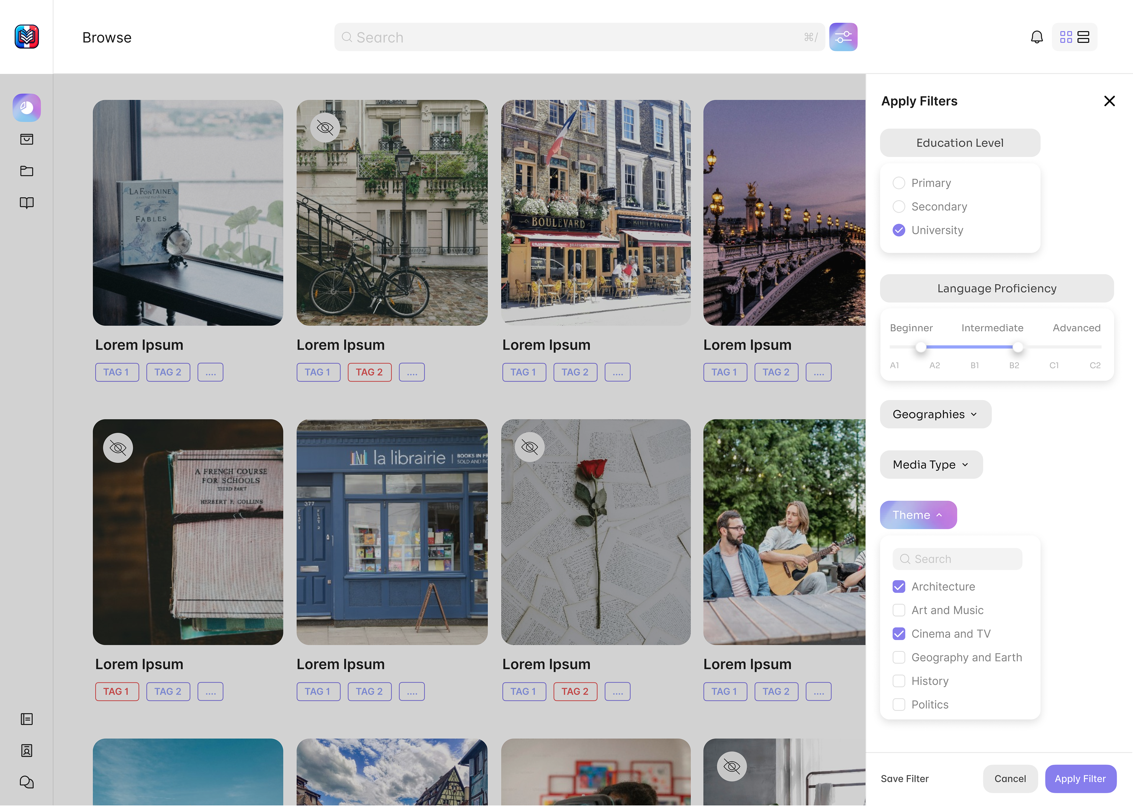
Fig 14 Filter Pop up
Implementation
Collaboration
Our team worked closely with stakeholders and conducted design critique sessions with other teams, professors, and our client to ensure the feasibility of the design. Regular meetings facilitated progress updates and collective decision-making.
Challenges
Technical Constraints: Adjusted design elements to accommodate technical limitations without compromising user experience. For instance, I simplified complex animations to reduce load times and streamlined the interface to ensure smooth performance across different devices.
User Privacy: Addressed privacy concerns by implementing a unique user identification method that used passphrases instead of personal data. This innovative approach allowed us to match users to accounts based on phrases they entered, ensuring privacy while maintaining personalized experiences.
Limited User Interviews: We faced a challenge due to the unavailability of French teachers, as their schedules did not align with ours and the limited time we had. To overcome this, I improvised by adding a survey to gather more information efficiently, ensuring we still gained valuable insights despite the scheduling conflicts.
Reflection
Learnings
User-Centered Design: Putting users first made all the difference. For example, I made the search bar more prominent and intuitive based on user testing, and streamlined the interface by hiding filters within a collapsible element, reducing clutter and enhancing usability. This aligns with Hick's Law, which states that simplifying choices improves user decision-making and efficiency.
Prototyping Skills: I got to flex my creative muscles, building a prototype that really brought our ideas to life.
Teamwork Makes the Dream Work: Collaborating with my team taught me the true power of working together and making the most out of each others strengths, boosting our project management and communication skills along the way.
Client Testimonial
"I have very much enjoyed working with the team. What I particularly liked is how professional they were: they set out their objectives really and made it easy to understand what they needed from me as the client. It was good to see they divided roles very well, and I still managed to interact with all of them in different ways: it was clear who was in charge of which design for example. I also appreciated their acknowledgment of the challenges they found along the way: I know that timetabling issues were encountered, and it was quite tricky to find suitable times to meet the teachers at short notice. But it wasn’t a major issue on my end at all, and I was really impressed at how the team took the project on board and managed to make it their own (even though it was already further advanced than most projects), and were able to really deliver on the brief and outputs."